Hello, I'm Youngjae Kim from ABC Studio. I oversee development of Demaecan, Japan's leading delivery service, which was acquired by LINE in 2020.
It's common for IT companies and services worldwide to emphasize the importance of listening to user feedback. Yet, few truly integrate this feedback seamlessly into their decision-making process. I'm someone who frequently sends feedback on any product I use. For example, I've submitted over 130 pieces of feedback to JetBrains, a developer of programming tools, and around 70 to Windows, with 35 of my suggestions being acknowledged and incorporated into the product. Since joining LINE, I've also put forward over 90 pieces of feedback for Naver and LINE services through our internal channels.
Writing feedback has become a habit for me, but it's also a way to gauge the agility of product teams. Take Slack for example, I've been impressed with their efficient feedback process, from receiving feedback to updating users on progress. Upon joining LINE, I realized there are fewer avenues for listening to user feedback than one might expect. Is this a sign of the company's disinterest in user input? Certainly not. The real challenge for most companies is being able to respond to user feedback flexibly. As a product creator, I've spent the last five years experimenting with different solutions to this issue, and now that I'm beginning to reap the benefits, I'm eager to share what I've learned.
For a general introduction to the ABC User Feedback product, the result of this article, please refer to the blog post Service for Managing and Utilizing User Feedback Effectively, ABC User Feedback (Article written in Korean) shared by our team.
To give you an idea, as shown in the figure below, our internal repository contains 14 initial attempts; essentially the first traces of the product's development. If the repository were a residential area, it would be comparable to a neighborhood dotted with over ten vacant houses.
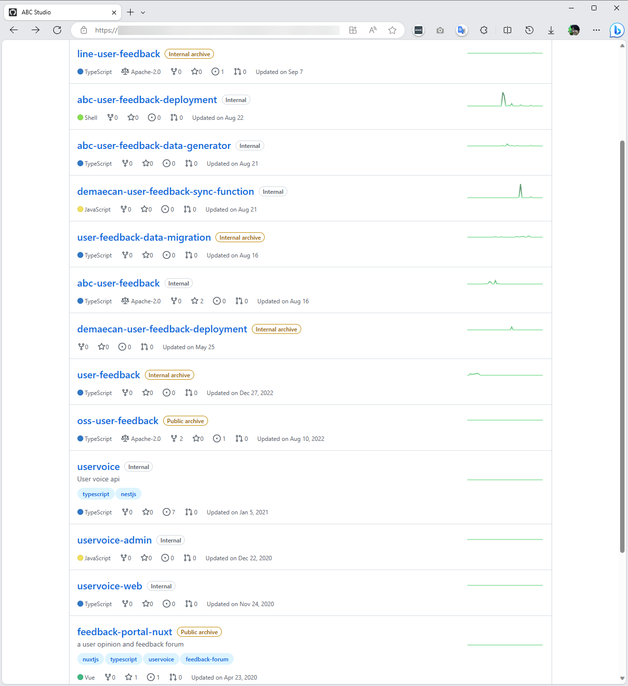
If nobody will make one I'll make one myself
Many services that collect and organize user feedback efficiently exist as SaaS products. For instance, UserVoice.com, Zendesk, and Aha! have been actively used around the world for over ten years.
The image below is a captured screen of the user feedback SaaS used by Microsoft Azure: User Feedback SaaS.

Upon examining the functionality based on the interface, it seems to be a conventional question-and-answer board with three added features. There's an upvote function that lets other users add weight to the posted opinions, a feature to display the company's response and the progress status for each piece of feedback, and the ability to group similar topics into one feedback thread for clarity.
When I was working at a startup, I incorporated such services into our app to collect user opinions. Going through user requests every day, working tirelessly through the night to enhance the product, and then seeing how satisfied our users were was incredibly motivating and deepened my engagement with the product.
But now, there was an issue. A decade ago, there were numerous free user feedback-related SaaS products available, and I took advantage of these free services. However, over the years, the free options have disappeared, and the cost of paid services has become prohibitively high. It seems the strategy has shifted towards focusing on larger clients, as converting free users to paid ones was likely not as profitable. The more affordable options today allow for feedback collection from 200 users at a monthly fee of $699; an approach that is woefully inadequate for services with millions of MAU.
This prompted the thought, "If it's just a message board with a few additional features, could I build it myself?" From a developer's standpoint, the cost doesn't significantly increase whether you're providing a service for 200 or 10,000 users. Thus, user number restrictions are more of a business strategy. As previously mentioned, it wouldn't be financially rewarding to develop such a service for commercial sale unless targeting large enterprises. This led me to consider creating it as a side project.
As I've noted, upon closer inspection, the functionality is akin to the typical web board services outlined in mid-level frontend development textbooks, with a single repository separating the frontend and backend into directories. Although I found several open-source projects on GitHub that were similar, most were merely passion projects made for practice and not maintained at a level that would inspire confidence for use in a production environment. Given that today's frontend developers are quite capable of setting up a basic CRUD server, I realized that if I could find just one like-minded developer, we could attempt to build it ourselves.
The first attempt - It failed to even resonate within the team
Back in 2019, I teamed up with a frontend developer. While I sketched out the requirements, the developer began implementing them rapidly. Our focus was on creating a proof-of-concept (PoC) rather than an open-source solution, primarily because I was the only one with experience using specialized tools for collecting user feedback. Most people were more accustomed to giving feedback by calling customer service or sending an email. Even those who were in the business of creating internet services were often uncomfortable with forum-style feedback platforms, and for many, this was their first encounter with such interfaces.
Two months in, we introduced our PoC product; a straightforward message board that displayed feedback in a forum layout and showed the number of likes each post received. Would you like to know how the team responded to this?
While I valued the user scoring experience, it didn't resonate with many others. Some argued that focusing too much on scores when receiving user feedback could lead us to lose direction in our service. I shared this concern. In observing services with feedback forums, it's not uncommon to see certain feedback remain highly scored for years without any action taken. Although this may be due to the product's roadmap, it still wasn't a positive sign.
As a result, our first attempt, hastily assembled in two months by drawing inspiration from various feedback service UIs, ended inconclusively without being adopted. The emphasis on speed had made it difficult for other colleagues to pick up where we left off, and the maintainability of the code suffered due to the lack of effort in design.
So, given the feedback we received about the scoring system being unfamiliar to many during the first attempt, what if we eliminated the scoring feature?
The second attempt - Building it is one thing; managing it is another
Initially, I wanted to recreate many elements of SaaS platforms that are popular outside of Korea. The idea was to have an open forum where all opinions were visible and users could assign scores to each other's feedback, determining the community's consensus. However, my colleagues were not accustomed to this method, so I considered a more familiar approach to collecting feedback, inspired by Google Forms.
Unlike before, where the first screen showed a list of user feedback, we now started with an input form similar to Google Forms. Our company didn't have an appropriate system for external service surveys, and due to security policies, we couldn't use services like Google Forms. I hoped that if this revised product succeeded, it could become a survey tool for user feedback across various company services.
Below is the UI flow of the system developed in the second attempt.
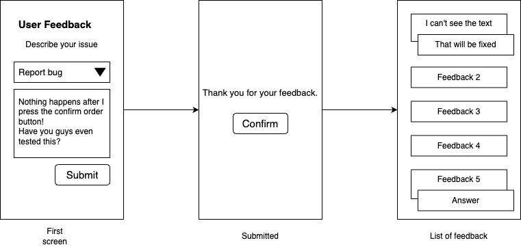
First, a form appears asking for user feedback. After submission, users might receive a simple thank-you message or a notice about the receipt order of their feedback. Then, a list of feedback from other users is displayed.
This display was intentional to reduce the worry users might have about being overly critical. By seeing others' feedback, they could be reassured that they were not alone in noticing certain issues.
Even in the development phase, we had to make compromises. I initially wanted to provide a straightforward cloning experience with just one repository. However, anticipating frequent changes to the user-facing front-end UI, we decided to separate the repositories for the frontend and backend to avoid affecting back-end deployments with each change.
While splitting the system was not ideal, my primary objective was to create a process that would integrate user feedback into the product. I was prepared to accept any form the product might take, as long as the process was in place.
Here is the final version of our second attempt.
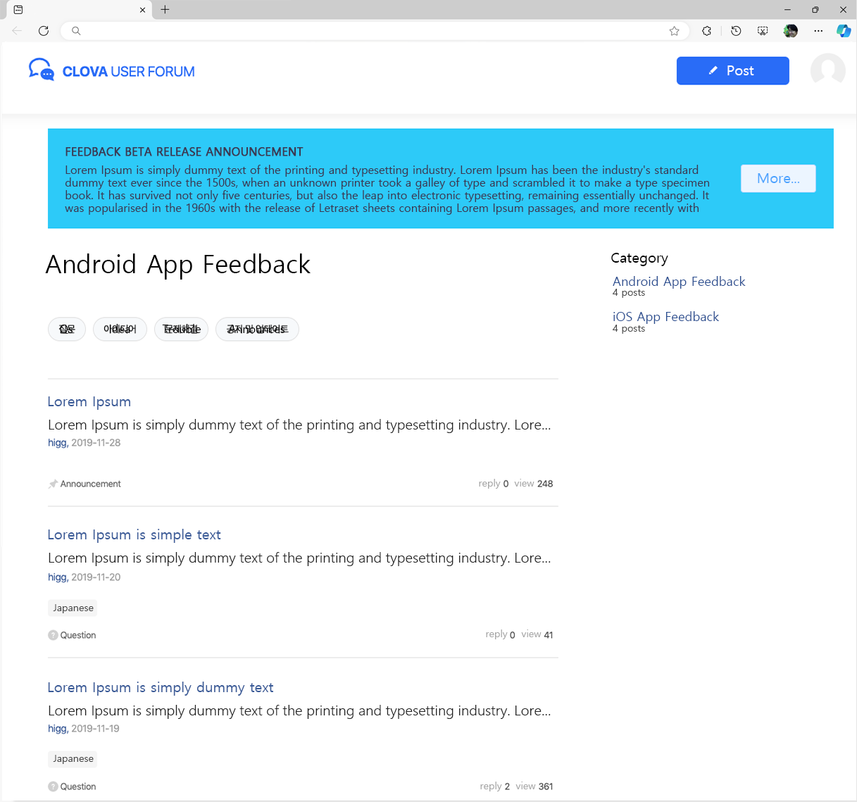
In the final product, we removed the voting scores from the feedback list. Instead, we enabled administrators to manually merge duplicate issues, effectively allowing the community to still weigh in on the importance of each topic, albeit through a more manual process.
After finishing the product, I advocated for its integration into the service I was overseeing, given my full decision-making authority. However, there was resistance from the business and operations teams, who felt they couldn't manage the incoming feedback.
Who should manage feedback? If customer service takes the lead, we risk repetitive, uninspired responses. Should the business unit be responsible when they don't directly engage with the service or its users? Or should it fall to the product team, who felt it was too much to handle alongside their primary focus on product development? Moreover, responding to feedback, even with simple messages, could lead to issues over nuances such as tone, necessitating clearly defined roles.
In smaller companies, a passionate and articulate individual might naturally assume this responsibility, but in a larger organization with a set hierarchy, assigning clear roles proved to be a significant challenge. Consequently, the second attempt of 2020 also went by without being implemented.
The third attempt - A structure too complex to sustain
Following the setback of not being able to implement the second attempt, I redesigned the product. This time, I set out with a clear intention to develop it as an open-source project from the beginning, putting into practice the methodology I discussed in my blog post titled "Designing Software Like an Open Source." To simplify deployment, I merged the separate repositories back into a single one.
Designing software with an open-source mindset is a great practice, regardless of whether the end product will be open source. My article Designing software as open source could be a useful reference for this approach.
We re-evaluated the features and decided to strip them down to the bare minimum, ensuring we stayed true to the fundamental purpose of "collecting user feedback". This led us to remove the web form and expose only an API for inputting feedback, giving technical users the flexibility to create their own input interfaces, be it through web forms or apps. I presumed that any team interested in cloning this product would possess a reasonable level of technical expertise.
The guiding principles for our product philosophy were "Simple installation" and "Your data is yours".
Simple installation
Simple installation was realized through two key approaches:
- Execution with a single docker-compose file — Container technology ensures that an application can run reliably by isolating its operating environment from the infrastructure. Docker, in particular, has gained widespread popularity for its clear configuration standards. ABC User Feedback includes a Docker configuration file within the repository, enabling immediate execution and system setup understanding upon cloning. This feature is not common in many Node.js or frontend projects, which can lead to operational issues due to specific library dependencies across different environments.
- Providing a web admin UI from the outset — Having a web admin UI available immediately after installation can greatly reassure those who have installed the service. Few products, especially open-source ones, offer this kind of user experience. The likely reason is the complexity of frontend development for web browsers. Backend-focused projects may lack the resources for frontend work, which involves additional security considerations for browser communication. Also, without a designer, creating a visually appealing and trendy user experience can be a daunting task. However, we believed that the ability to manage feedback via a web browser was crucial for realizing the full potential of ABC User Feedback.
Your data is yours — Defining data ownership
"Your data is yours" is a statement increasingly championed by cloud services and SaaS platforms in recent years. It appeals to customers because it appears to mitigate concerns about vendor lock-in and the handling of personal information.
The implementation of "Your data is yours" can vary in complexity. The main levels are as follows:
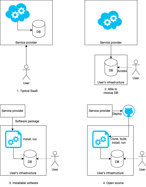
- In a standard SaaS setup, the physical data storage resides on the provider's infrastructure. Legal safeguards in the terms of service, certifications like ISO, and the provider's data encryption capabilities are designed to prevent the provider from easily accessing the data.
- Users have the option to select their own infrastructure for physical data storage. However, the service logic is still controlled by the provider, necessitating configurations that allow database access over the internet. The security of such internet-exposed databases falls to the user.
- Providers offer installable software, enabling users to choose their infrastructure for both data storage and the execution program. The execution program, however, is not open source, typical of many enterprise installable software solutions.
- Open-source code is provided, allowing technical users complete control and responsibility, from installation to database management.
ABC User Feedback falls into the latter category as open-source software, with the technical user overseeing the entire operation, from the database to the execution program. This approach is seen as the most transparent, with full ownership rights resting with the data owner.
Even with these foundational principles, the project's priority often lagged behind other company responsibilities, especially since it was developed by just one person. There was also a prevailing sense of doubt about the practicality of building a product without an immediate use case; whether it would ever be utilized remained uncertain.
However, we did release the third attempt as open source on LINE's GitHub organization. At the time of writing this, the current version is 4.0, but it began with version 1.0. I navigated LINE's open-source release process, from security checks to license validation, yet as spring 2021 came and went, the product still hadn't been integrated into any services.
The fourth attempt - Persuasion attempt successful
At this time, ABC Studio embarked on a project to rejuvenate the product for Demaecan, Japan's No.1 delivery service acquired by LINE. I, now sporting a few more gray hairs, took the helm to lead the product's revamp.
If you're familiar with delivery services, you'll know there are three primary user groups: customers, restaurants, and delivery personnel. The renewal began with the delivery sector, from the server's dispatch logic to the app for delivery personnel. Amidst this comprehensive update, we saw an opportunity to integrate the third attempt's version 1.0, albeit modestly.
This time, I managed to convince the business team! The development was no longer a mere side project but received the full attention it deserved. One developer was dedicated to ABC User Feedback development, aligning with their performance goals, and they were fully engaged.
For the fourth attempt, we rewrote most of the code. Despite the functionality being almost identical to version 1.0, gaps became apparent when we tried to apply it to an actual service, and technology trends had evolved. The delivery app was also successfully revamped, transitioning from React Native to Flutter. For more details, refer to my 2022 article, Rebuilding Japan's No.1 Delivery App from the Ground Up - The Recode Project (Article in Korean).
The delivery app included a feedback menu, as depicted in the screenshots below. The Support Center menu on the profile screen offers options to view FAQs and access the User Feedback button. Users can choose between the "Opinion" and "Bug Report" categories.
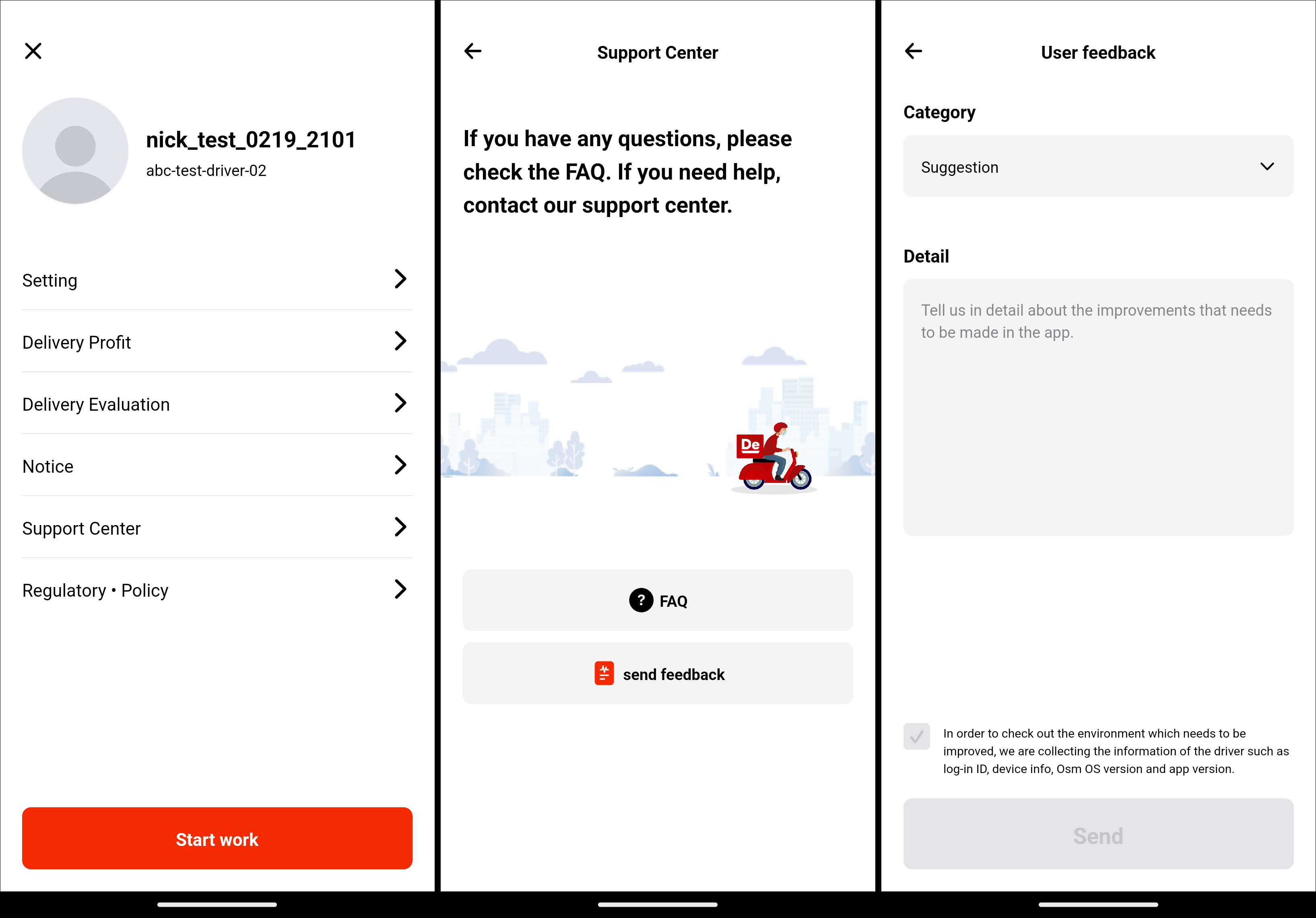
What might seem like just another input field to some is, to me, a profound achievement that still moves me as I write this.
Where the second attempt faced ambiguity in operational responsibility, this time a planner was appointed to compile and analyze feedback weekly. User feedback from the User Feedback feature also began to be quantified when setting product requirements and priorities.
ABC User Feedback began to show significant results after being integrated into the app. With monthly releases, user satisfaction steadily climbed, eventually receiving more favorable reviews than those of competitors. The tool helped us quickly identify post-release bugs and refine the specificity of user feedback.
The chart below categorizes the feedback compiled by CS at a certain point. From left to right, the categories are for customers, restaurants, and delivery personnel. The delivery personnel's category is notably more detailed and evenly distributed. Any guesses as to what this might imply?
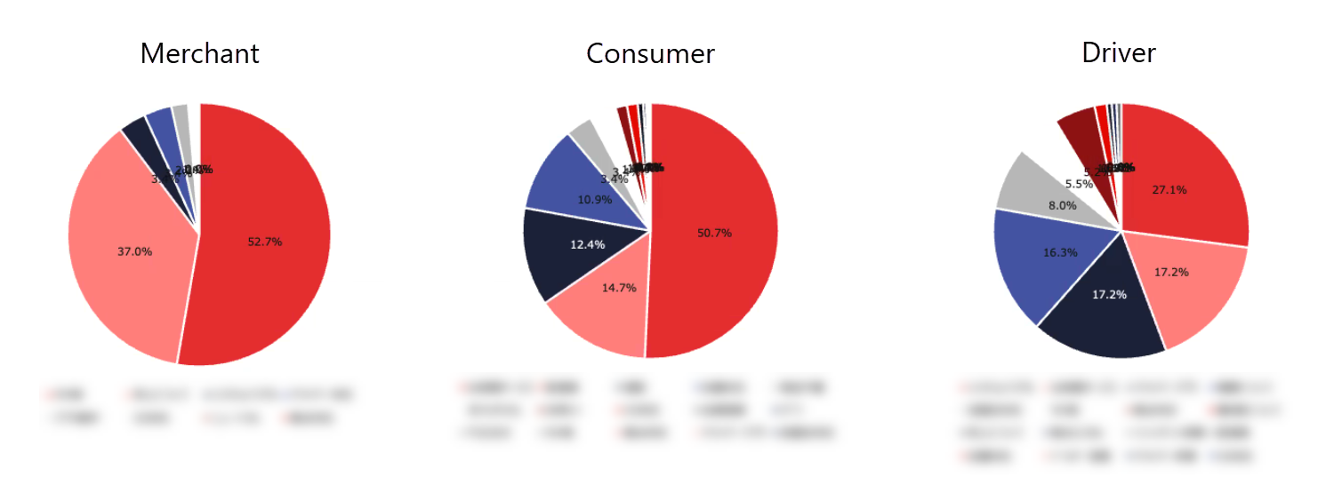
Consider a friend who dresses in a peculiar fashion and asks for your advice. Initially, you might simply say, "I don't like any of it", but as they make changes and continue to seek advice, your suggestions might become more precise, such as "Change your shoes", and later, "Try green shoes". In the same way, as users see their feedback gradually impacting the product, they begin to offer more detailed input.
For delivery personnel, the feedback categories initially numbered around five but soon expanded to over ten. For example, a general "slow response time" category could be divided into "slow notification popups" and "slow map screen", indicating more specific issues. This increasing level of detail signifies that user requirements are becoming more refined, suggesting that users are beginning to articulate their needs in the product's language. Witnessing this evolution with each release is a truly valuable experience for a product maker.
Observing the gradual rise in service usability scores over more than a year in the company's regular satisfaction surveys, there was a natural inclination to extend ABC User Feedback to services for customers and restaurants. By then, convincing others was no longer necessary; it was a matter of when, not if, the implementation would occur. It was indeed a fulfilling year in 2022.
The fifth attempt - From a four-person team to all Demaecan services
After ABC User Feedback's initial implementation in the delivery app, I consistently highlighted its pivotal role in refining ABC Studio's product development process. As the team grew threefold, a collective desire emerged to pursue projects beyond core responsibilities. Naturally, interest converged on the project I had persistently advocated for, leading to the voluntary formation of a dedicated team, including a planner, a frontend developer, a backend developer, and a designer, all committed to developing a full-fledged web service.
The company's view of ABC User Feedback evolved. Although it added tasks for the CS team and planners, the tool's effectiveness was undeniable, and its value was clear without the need for further justification.
The main challenge was that version 1.0 was essentially a small message board. As we expanded to include other end-users (customers, restaurants), we needed the ability to create multiple boards. Otherwise, separate installations and updates for each end-user group would have made maintenance impractical.
Going back to square one became necessary. While the first three attempts were PoCs and the fourth an MVP, the fifth attempt was envisioned as a polished, complete product.
Development for version 3.0 commenced in early 2023 (we skipped to 3.0 for clear differentiation). To minimize the setbacks encountered during the third attempt, two developers were allocated full-time to 3.0's development, with assistance from other ABC Studio team members.
Version 3.0 was envisioned as a comprehensive enterprise solution for managing user feedback from all Demaecan services. It enabled the creation of projects (akin to boards) wherever user feedback was needed. Despite being a complete rebuild, we also had to consider data migration from the existing feedback system used by the delivery personnel.
Below is the UI of version 3.0, launched in August after six months of development.
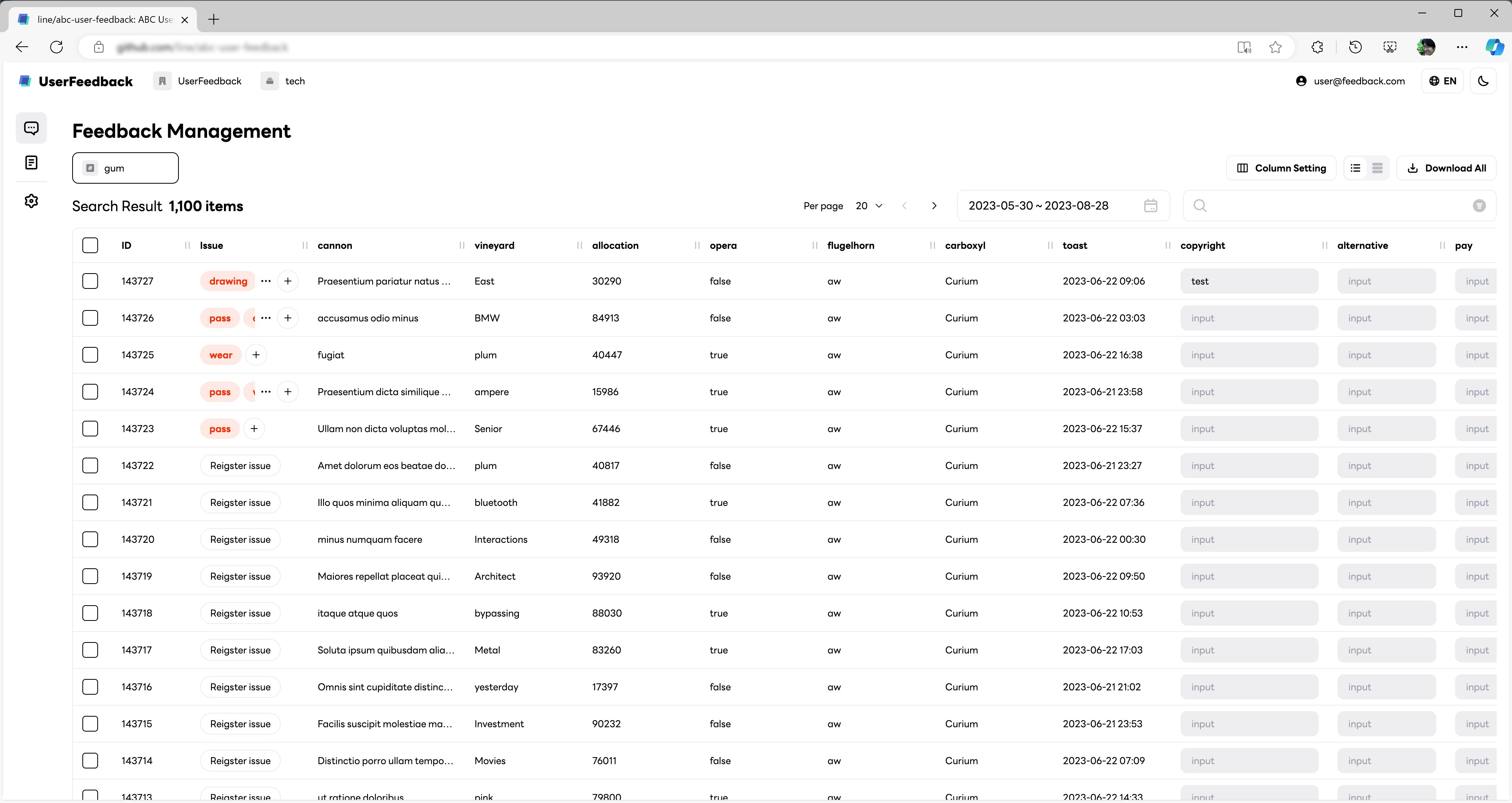
While resembling a conventional board, this version allowed for the creation of issues linked to feedback. Issues could be tagged with statuses like Under Review, In Progress, and Completed, effectively serving as a basic issue tracker that could also link to other trackers. It was possible to create multiple projects and channels within each project, enabling differentiation between in-app feedback and app store reviews.
We introduced OAuth 2.0 support for authentication, facilitating single sign-on (SSO) integration. While most SaaS products offer SSO starting with their enterprise tiers, which significantly increases costs, ABC User Feedback provides SSO through OAuth 2.0, commonly supported by authentication systems. I take particular pride in this feature, as it elevates the project beyond the hobbyist level, where basic ID and password are the norm for authentication.
We also enhanced search capabilities by supporting OpenSearch (Elasticsearch) connections and ensuring similar functionality with MySQL queries alone, significantly improving the product's craftsmanship.
The web admin UI was developed with a professional design theme and supported multiple languages and a dark mode. We also included features like API token generation in the admin UI, bringing the functionality and quality on par with commercial software. These advancements were possible because they were developed for actual application in a publicly traded company's services, meeting audit compliance requirements.
By 2023, ABC User Feedback had become an established internal service for gathering feedback from all Demaecan services.
From product to process, and back to product
Spring 2024 marked the full application of ABC User Feedback across all end-users. Teams could now see through the perspective of any user group, navigating projects segmented by end-user categories. Often, a restaurant owner's complaint might be rooted in a delivery person's actions. To truly understand the service, one must grasp the perspectives and situations of all users.
We settled on the following structure and process:
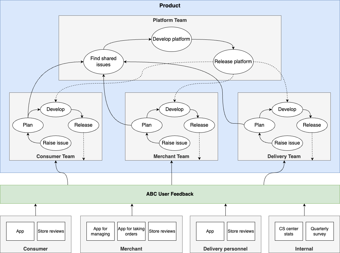
When users submit feedback through designated channels, product teams responsible for each end-user experience label these as issues for development. Platform services often involve trade-offs where enhancing one aspect can detriment another. Thus, it's vital for all decision-makers to align their viewpoints with those of the end-users. My goal was to establish this baseline by creating a product that consolidates user feedback and then formulating a team structure and process that leverages it.
Having a process in place prompted the need for internal improvements. For instance, visualizing and aggregating issues required separate steps in Excel. By strengthening ABC User Feedback's statistical capabilities, we could reduce administrators' dependence on Excel.
As a result, with the release of version 4.0 in January 2024, we introduced a stunning dashboard to enable more efficient statistical analysis for administrators.
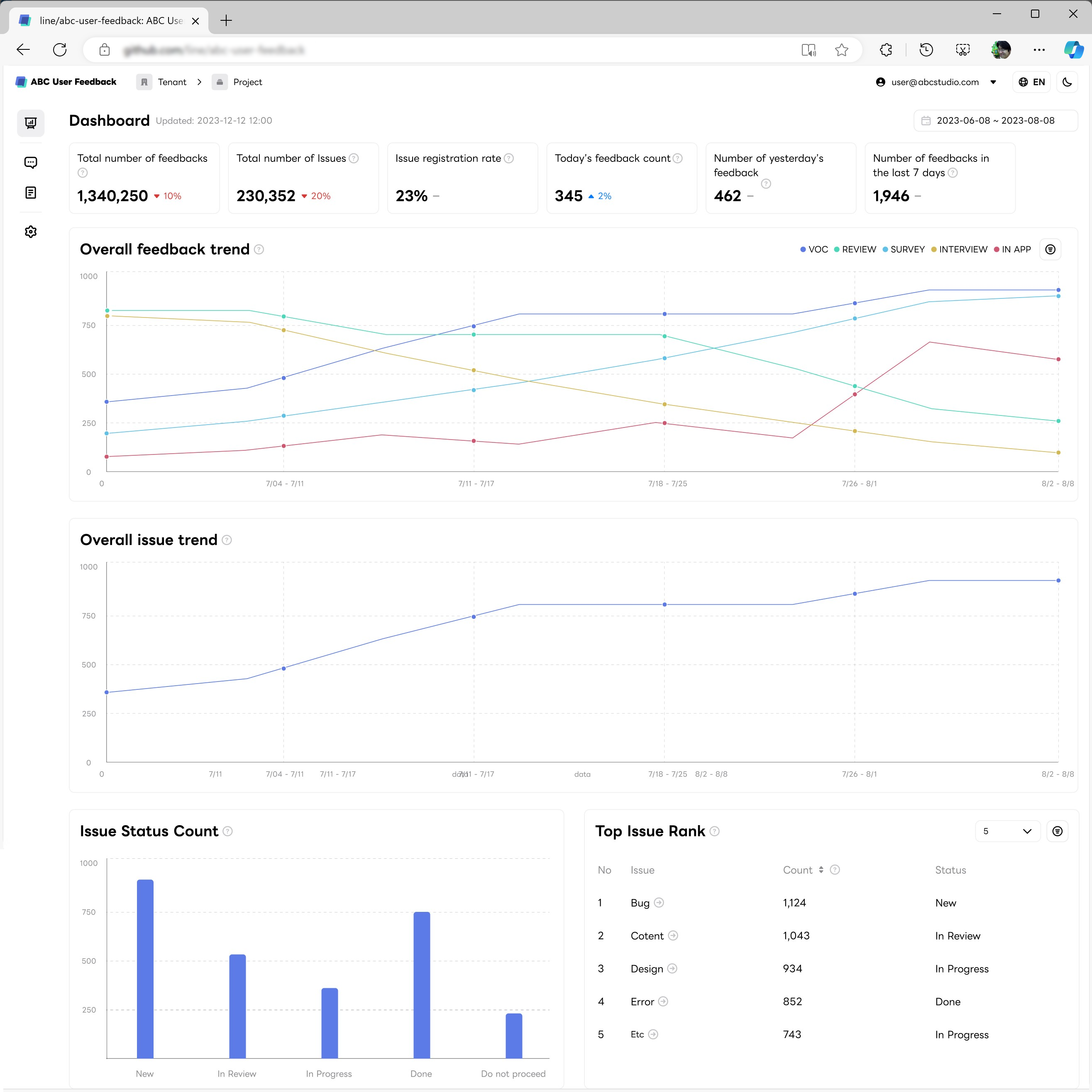
The tool now looks every bit the professional feedback management tool. Administrators can easily view daily feedback volumes, trends, and issue-specific progress. In this way, the product's usage and processes become intertwined, with each process informing enhancements to the product.
While we've significantly improved functions for collecting, tagging, and organizing feedback, the journey toward fostering a product culture that values and continuously refines user input does not end here. Ultimately, we need a feedback loop that shows contributors how seriously we consider their opinions. A simple way to do this could be to send a thank-you message via email or push notification once their feedback has been addressed. By supporting the complete lifecycle of a piece of feedback, we will solidify our standing as a specialized tool for handling user feedback.
Achieving this, I am confident that any product team using ABC User Feedback will experience a virtuous cycle of developing products attuned to user feedback.
In conclusion
Bringing a product from inception to a self-sustaining presence in actual services, while garnering support from the team, required more time than I had anticipated. Had I been extraordinarily lucky or persuasive, my initial attempts might have immediately resonated. However, I was neither, so persistence was my only recourse.
The secret to a product's success is straightforward: listen to users. Address small requests promptly and release them, while larger asks should be crafted with care before release. It may all boil down to appreciating the time users spend providing feedback and expressing gratitude. These accumulated experiences can make users feel like they are part of the product's development, fostering a natural sense of belonging and affection.
By using ABC User Feedback, developed by our team, you can adopt this straightforward approach in the most cost-effective, secure, and efficient manner. We welcome your interest and encourage you to take advantage of it.
