Hello. I'm Seyoung Cho from the Service Client Dev 1 team that develops the Android version of LINE. Recently, we've used Jetpack Compose, a declarative UI toolkit for Android, to build the entire UI for the Yahoo! search module on the LINE app. This module performs searches using the Yahoo! search engine, and supports functions like saving search terms, recommending search terms, and Yahoo! search. Take a look at the module in action below.

In this post, we'll examine what considerations we made when introducing Jetpack Compose to the Yahoo! search module, and what rules we set up to ensure efficient collaboration with a stable structure after its introduction.
The emergence of Jetpack Compose
For a long time, UI was developed using an imperative programming approach. With this approach, developers explicitly define how and in what order the UI should operate at each stage, managing the UI state and its operations directly.
This method is fine for simple UIs with few features. However, as the UI becomes more feature-rich and complex, problems arise. A complex UI with many features has multiple states, and dependencies between these states also become complex. To add a specific operation to such a UI, a lot of code needs to be added to handle each state without any issues. In this process, mistakes can occur, increasing the likelihood of bugs.
To solve this problem, the declarative UI development paradigm emerged. In fact, declarative programming itself is not new. Declarative programming, where you instruct the computer what to do and it produces the result using its internal algorithm, has already been used in SQL, HTML, and others. For example, when you run SQL, the RDBMS parses and processes the SQL internally and returns the result. We don't need to know what processing is happening inside the RDBMS. We only need to receive the result. Similarly, in declarative UI development, developers only need to define the state of what should be displayed, and the UI is drawn accordingly. Developers no longer need to handle state changes directly.
In 2021, Android started supporting a declarative UI toolkit through Jetpack Compose (hereafter referred to as Compose). Compose was a breath of fresh air to Android developers upon its release. Custom views that had to be developed in a complex manner with the imperative UI toolkit could be developed in a short time using Compose, and animation processing was also incredibly easy. The code became shorter, and since it was written declaratively, it was easy to understand how it worked. Thus, Compose significantly improved Android development productivity, leading many companies to adopt it. For instance, Twitter (now X) replaced all its UI with Compose (reference), and the newly developed Threads app from Meta composed most of its UI using Compose (reference).
Considering Compose introduction - Two conditions for maintaining LINE app stability
We have been discussing the introduction of Compose and have used it to create some debugging menus or views, but we haven't had a case where we developed an entire module with Compose.
The reason we couldn't easily adopt it earlier is because LINE, a messenger app used by hundreds of millions of people worldwide, prioritizes stability. The LINE app is used on a wide variety of devices, and even if only 0.1% of all users experience an error, that's still hundreds of thousands of people experiencing issues with the app. Therefore, it wasn't easy to adopt Compose, which hadn't been released for long.
Despite this, it was clear that we needed to adopt Compose, which could improve productivity and code maintainability. To introduce Compose without compromising stability, we defined two conditions.
- Since changing an existing view to Compose would require changing the way the view's state is managed, which could potentially lead to errors, it should be used in newly created views, not existing ones.
- We need to verify the stability of the composable we're using.
Let's look at the first condition. Compose provides the AndroidView composable and the ComposeView component for compatibility with existing views. However, we determined that if we used Compose only in some views of a specific module, the maintenance cost would increase because some views would be written in an imperative way and others declaratively. We thought it would be best to adopt the same UI configuration approach at least at the screen level (Activity or Fragment). However, we judged it inappropriate to completely change the existing UI, which is already operating stably, as it would be a case of the tail wagging the dog. At that time, we received a request to create the Yahoo! search module, and we decided to compose all views of the module with Compose.
Verifying the stability of the composable, the second condition, was a crucial requirement for introducing Compose to the Yahoo! search module. We identified and pre-identified problems with the Composables to be used in the screen to be created. We found that many issues were reported with LazyColumn and TextField. There was no problem using LazyColumn in Yahoo! search as we didn't use nested scrolling, but we found that TextField had several reported issues as follows:
So, we checked whether there would be any issues with state management when this part was created using the existing EditText with AndroidView. As there were no issues found, we decided to introduce Compose.
Introducing Compose - Four rules for structural stability and efficient collaboration
The first thing we did after introducing Compose was to establish rules. Since we hadn't used Compose before, we had to define everything from scratch, referring to the official technical documentation and related articles. Based on the order of work, we created the following four rules.
- Unify the points of UI state management
- Use state hoisting to make Composables stateless
- Create previews for each state of the Composables using the preview feature
- Attach previews to pull requests
Let's look at why we considered these four rules to be important and how we used them.
1. Unify the points of UI state management
In the traditional imperative UI toolkit, the UI state was held in the view. Therefore, even if the UI state was managed in the ViewModel, the view's state had to be updated when the UI state managed by the ViewModel changed.
For example, if the mainViewModel manages the screen title as titleStateFlow of type StateFlow<String>, you would have to create code to collect titleStateFlow and update textViewTitle, as in the following code.
class MainActivity : ComponentActivity() {
    private val mainViewModel: MainViewModel by viewModels()
    ...

    override fun onCreate(savedInstanceState: Bundle?) {
        super.onCreate(savedInstanceState)
        ...
        lifecycleScope.launch {
            mainViewModel.titleStateFlow.collect {
                textViewTitle.text = it
            }
        }
		...
    }
	...
}
The problem with this code is that it manages the UI state in multiple places. In the code above, the text of textViewTitle is in the same state as the value of titleStateFlow in mainViewModel. However, the state of text in textViewTitle can be changed anywhere outside of the part that collects titleStateFlow.
For example, if you add just one line as shown below to explicitly change the state of text in textViewTitle to "Dummy Text", the consistency between the state value of text in textViewTitle and the value of titleStateFlow in mainViewModel gets broken.
class MainActivity : ComponentActivity() {
    private val mainViewModel: MainViewModel by viewModels()
    ...

    override fun onCreate(savedInstanceState: Bundle?) {
        super.onCreate(savedInstanceState)
        ...
        lifecycleScope.launch {
            mainViewModel.titleStateFlow.collect {
                textViewTitle.text = it
            }
        }
		textViewTitle.text = "Dummy Text"
		...
    }
	...
}
As such, modifying and updating the state in multiple places can break the consistency of the state. As the UI becomes more complex, it becomes harder to predict what state the UI will be in because the state is changed and updated in multiple places.
As I mentioned earlier, Compose is a declarative UI toolkit. It creates a UI based on the state, and if the state changes, it goes through a recomposition process to reconfigure the UI. Therefore, state management is more important in Compose than ever before. If you manage the state in multiple places like in imperative UI, it would be hard to track.
Because of this, we decided to centralize the point of managing the UI state in Compose, and we chose to do this by centralizing the UI state management point in the ViewModel and exposing it to the outside. Inside the ViewModel, we updated the data using MutableStateFlow, and we made this MutableStateFlow expose data to the outside by type casting it to StateFlow.
class YJSearchActivityViewModel(
... // Receives use case injection
) : ViewModel() {
private val searchTextMutableStateflow: MutableStateFlow<TextFieldValue> =
MutableStateFlow(TextFieldValue(""))
val searchTextStateFlow: StateFlow<TextFieldValue> = searchTextMutableStateflow // Exposes search term data
private val pageDataMutableStateFlow: MutableStateFlow<PageData> =
MutableStateFlow(PageData.Loading)
val pageDataStateFlow: StateFlow<PageData> = pageDataMutableStateFlow // Exposes result page data
...
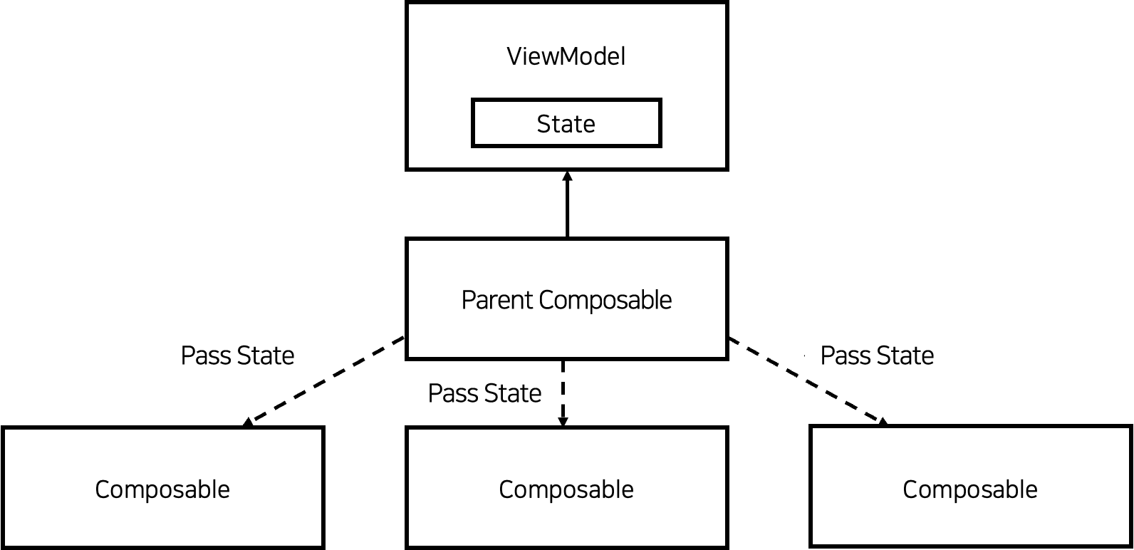
}However, a problem arose here. If all composables directly reference the ViewModel to get the UI state, each composable would have to request a StateFlow subscription from the ViewModel to get the state, thus becoming dependent on the ViewModel. In other words, the structure would be as follows.

In such a structure, each composable loses the reusability advantage of Compose because it depends on the ViewModel. To break this dependency, we created a composable that receives the state value from the ViewModel and passes it to child composables.
The YJSearchResultPage in the code below is an example of this. YJSearchResultPage injects the ViewModel, subscribes to the state via collectAsState, and passes that state to its child composables.
@Composable
fun YJSearchResultPage(
    modifier: Modifier = Modifier,
    yjSearchActivityViewModel: YJSearchActivityViewModel,
    ...
) {
    val pageData by yjSearchActivityViewModel.pageDataStateFlow.collectAsState() // Updates child composables using this data
	...
}
With this approach, we've eliminated the dependency by ensuring that child composables, with the exception of the parent composable that injects the ViewModel, do not directly reference the ViewModel.
To make the parent composable pass the state to its child composables as described above, the child composables must not manage the state directly. In other words, all child composables needed to be made stateless so that the parent composable could inject the state. To achieve this, we used state hoisting.
2. Making composables stateless using state hoisting
In Compose, state hoisting refers to the pattern of lifting the state of a child composable up to its parent composable, thereby making the child composable stateless.
To understand state hoisting, let's first look at the TitleTextField, a stateful composable, along with the example code below.
@Composable
fun TitleTextField(
    modifier: Modifier = Modifier,
    title: String
) {
    var value by remember { mutableStateOf("") }

    Column(modifier = modifier) {
        Text(text = title)
        TextField(
            modifier = Modifier.fillMaxWidth(),
            value = value,
            onValueChange = { value = it }
        )
    }
}
Inside the TitleTextField, it manages a state of type String called value. A composable that manages its state internally like this is called a stateful composable.
To make TitleTextField stateless, it must not manage the value state directly within itself. At this point, you can use state hoisting to lift the value state up to the parent composable. To lift up the value state, you need to divide it into two variables.
- value: T
- onValueChange: (T) -> Unit
value is the state value, and onValueChange is a lambda expression that changes this state. If there's no operation in the composable to change the state, onValueChange is not necessary. However, since value in TitleTextField is declared as a mutable variable var and has an operation to change the state, both are needed. Using these two, you can change TitleTextField to be stateless as follows.
@Composable
fun TitleTextField(
modifier: Modifier = Modifier,
title: String,
value: String,
onValueChange: (String) -> Unit
) {
Column(modifier = modifier) {
Text(text = title)
TextField(
modifier = Modifier.fillMaxWidth(),
value = text,
onValueChange = { onValueChange(it) }
)
}
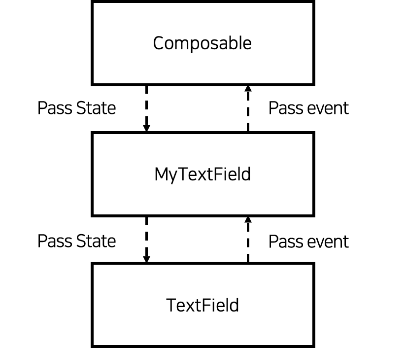
}In the TitleTextField using state hoisting, there's no longer any state management. There's only a part where the parent composable injects the state. The method of making child composables stateless using state hoisting is widely used in Compose. You can actually see it in the TextField used inside TitleTextField. The TextField receives state from the parent composable through value, and it calls the onValueChange function to notify the parent of the state change event. The entire process is represented in the following diagram.
 The diagram below shows the overall structure of the composable created using state hoisting. We've made all the child composables stateless, and designed a common parent that receives the state from the
 ViewModel to pass the state it receives from the ViewModel to its child composables.
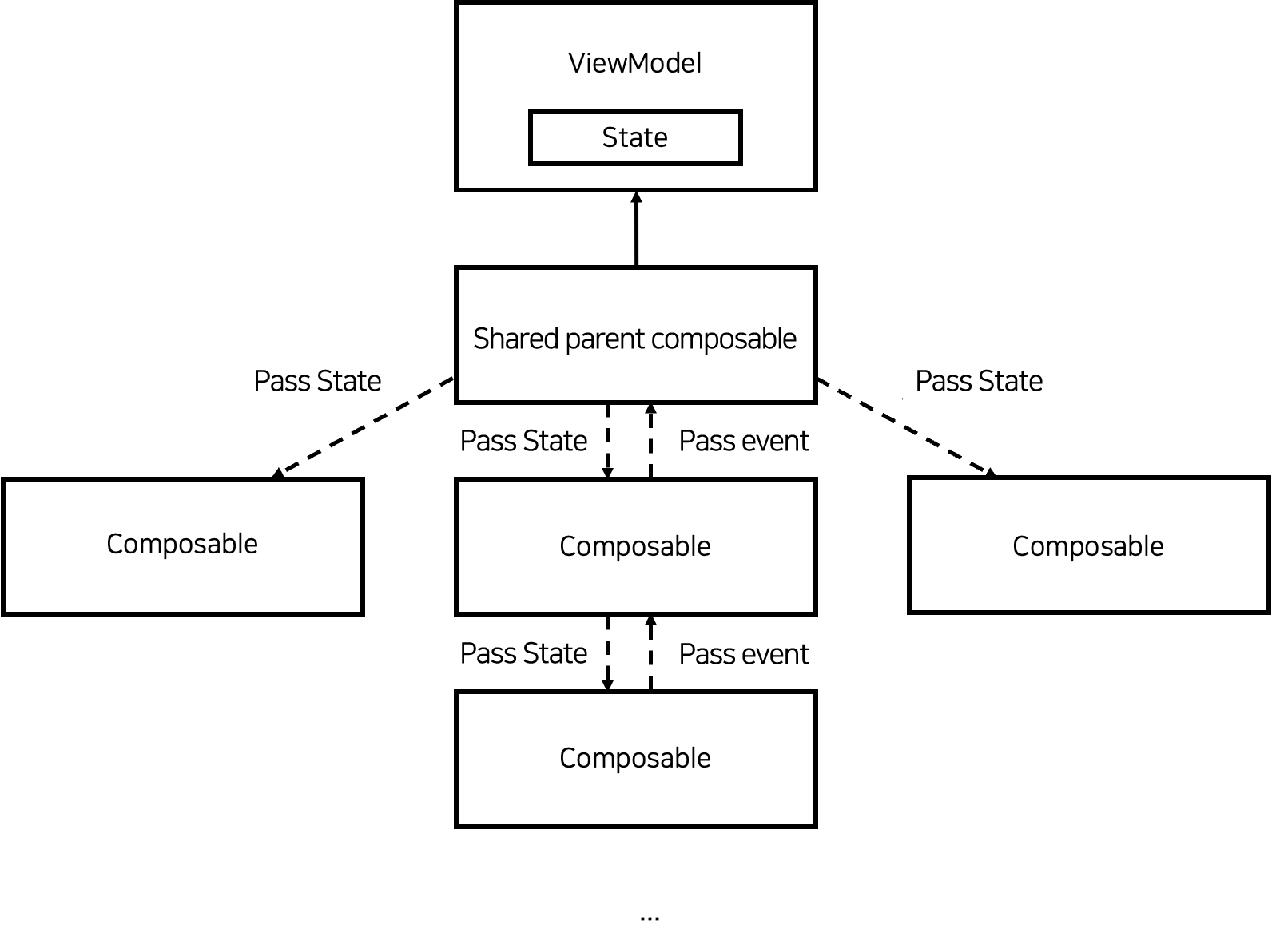 Below is one of the composables we've created. You can see that it doesn't manage any state internally.
fun HistoryKeywordItem(
    modifier: Modifier = Modifier,
    historyKeyword: HistoryKeyword,
    onHistoryKeywordClicked: (HistoryKeyword) -> Unit,
    onDeleteHistoryKeywordClicked: (HistoryKeyword) -> Unit
) {
    Row(
        modifier = modifier
            .clickableDefaultRipple {
                onHistoryKeywordClicked(historyKeyword)
            }
        ...
    ) {
        ...
        Text(
            ...
            text = historyKeyword.text,
            ....
        )
        ...
        DeleteHistoryIcon(
            ...
            onIconClicked = {
                onDeleteHistoryKeywordClicked(historyKeyword)
            },
        )
    }
}
So far, we've looked at how we've made child composables stateless and centralized the point of state management to handle Compose stably. Next, we'll look at how we've utilized the preview of the composable for easier and more convenient collaboration.
3. Creating previews for each state of the composable using the preview feature
We standardized the creation of previews for each composable we write to facilitate more comfortable collaboration. The rules we've set for creating previews are as follows:
- Create previews for each possible state in the composable
- Create previews for both light and dark modes
Let's first look at the first rule. With the existing XML, you could use related tools to insert some states like text for preview, but you could only insert one value at a time. Compose allows you to create multiple instances of the same composable in one preview and pass different state values to each, allowing you to preview multiple states. Using this, we created multiple instances of the same composable in the preview, input possible state values according to the UI requirements, and checked whether they were drawn correctly according to the requirements. The previews we created this way not only helped to verify if the composable was created correctly, but also helped our colleagues understand the composable easily.
Next, let's look at the second rule. When we were using XML, we often found parts where the dark mode color was not applied and fixed them during QA. To solve this, we used the uiMode as an argument to the @Preview as shown in the code below, to preview what it would look like when the device is in dark mode, making it easy to check whether the color has been applied.
@Preview(
    ...
    uiMode = Configuration.UI_MODE_NIGHT_YES
)
private fun HistoryKeywordItemPreviewDark() {
    ...
}
The previews created by applying these two rules helped reduce the time to understand the composable code and allowed us to quickly grasp what it looks like for each UI state.
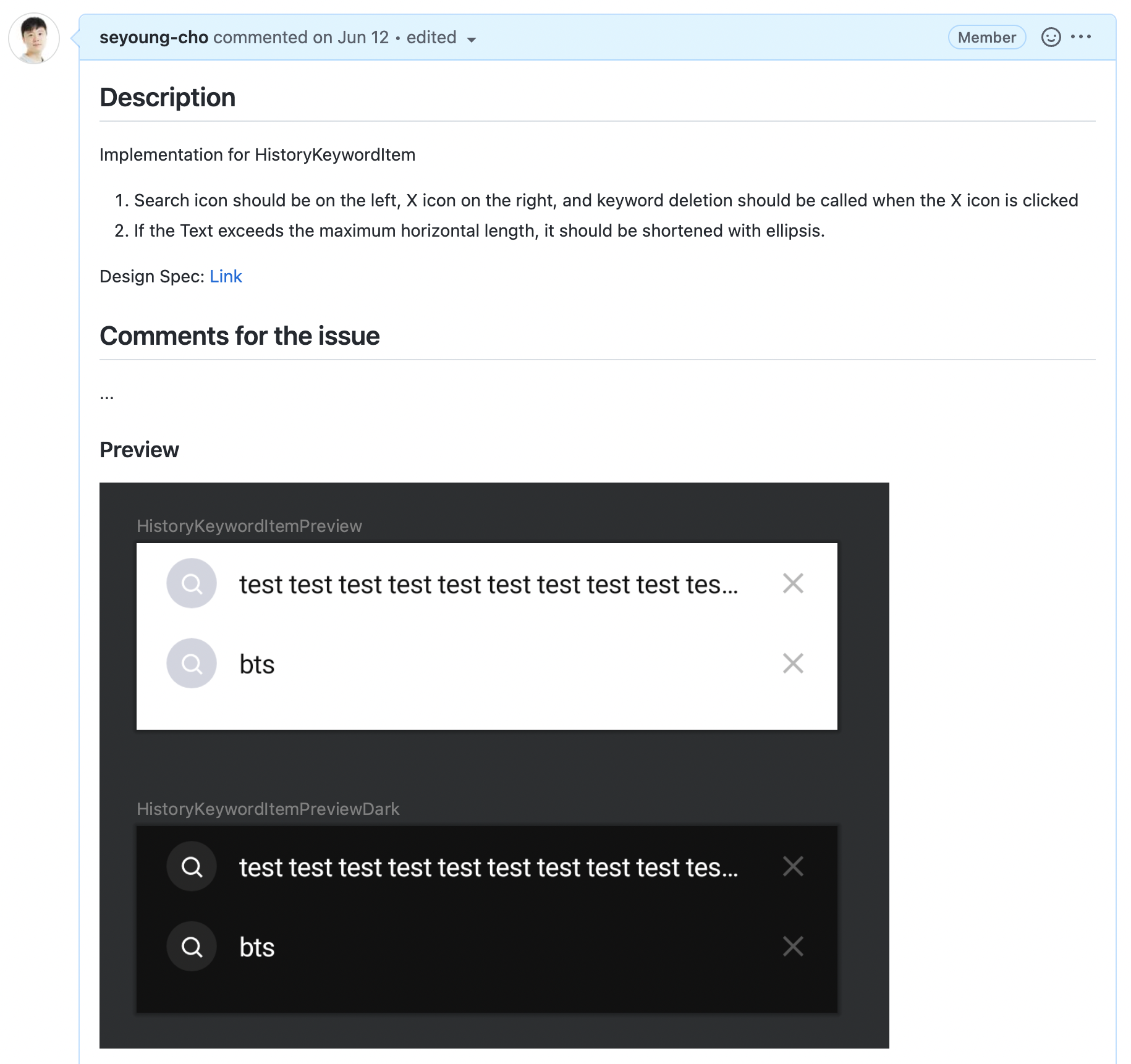
The image below is the HistoryKeywordItem composable that applied the rules for creating previews.

The requirement for HistoryKeywordItem was to display an ellipsis symbol if the range that the Text composable can draw is exceeded. To check this, we created a preview that included a sufficiently long string to potentially display the ellipsis symbol and a short string state, and we also created a dark mode preview below it. Through this, you can see at a glance what the HistoryKeywordViewItem composable looks like and what shape it takes depending on the state value.
4. Attaching previews to pull requests
The previews we created earlier are attached to pull requests along with a summary of design requirements and a link to the design specs. When we were writing UI with XML, it was not easy to explain what UI we had drawn, but using the preview feature of Compose made it easy to explain to colleagues what UI we had drawn. When I received a review request and was reviewing it, it was easy to review by first understanding the shape of the composable through the preview and then focusing on how it is drawn depending on the state when looking at the code.
Below is an example of a pull request that I actually created (I've omitted parts that are not important with "...").
With a pull request like the one above, you can see at a glance what has been developed and easily understand how the design specs were reflected in the composable. Therefore, it's easier for the reviewer to review while looking at the composable implementation.
Conclusion
In this article, we've looked at the considerations and attempts we made to safely introduce Jetpack Compose, a declarative UI toolkit, into the LINE application used by hundreds of millions of users worldwide, and what rules we set up to collaborate more efficiently with a more stable structure after introduction. Through this process, our team was able to introduce Compose stably into the LINE app. Although we were using Compose for the first time, we were able to create a good architecture and establish a basis for easy and comfortable collaboration. Because we experienced firsthand how powerful Compose is, we plan to actively introduce Compose wherever it's deemed useful in the future.
The shift to the declarative UI paradigm is an inevitable trend, as many problems arising from imperative UI toolkits can be solved with declarative UI toolkits. I hope this article will be helpful to many people who are considering introducing Jetpack Compose. Thank you for reading this long article.